interior iterations
31 Aug 2020 04:10 pmOne downside of having this HUGE delay between the initial plan and execution of our remodeling is that I've had time to change my mind about what I wanted a bunch of times. Originally I wanted to paint the dining room built-ins blue, but I changed my mind about that and now I'm going to use that blue paint elsewhere. I have a ton of furniture to paint, so that's no hardship.
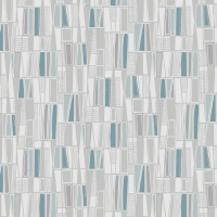
Originally we bought Boråstapeter Retro wallpaper for the kitchen intending to put it on the long wall opposite the cabinets, and since buying it I had time to decide I wanted it on the short wall, then to decide I wanted it above the cabinets, then to decide I wanted it on the short wall after all, to regret buying it at all because I had a brief affair with floral wallpapers in kitchens, and finally to decide I want it on the long wall as originally, opposite white upper cabinets and lower cabinets now painted to match these blue subway tiles on the backsplash. (Only the doors are painted, and they're still upstairs curing, not on the cabinets yet, because as I JUST MIGHT have previously mentioned, OUR COUNTERS STILL AREN'T ATTACHED!!!) (The remaining walls are going to stay white. Probably.)
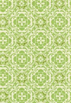
And we also originally bought Pihlgren & Ritola Atomi wallpaper for one short feature wall in the livingroom, where the remaining walls are approximately this spring-greenish off white... except there's one corner of masonry walls from the chimney at the center of the house and I intend to strip some nasty wallpaper off those and re-render them as masonry walls. White limewash is obviously the traditional finish for a masonry wall, particularly as the current cast iron woodstove that sits there is taking the place of what would have originally been a tile stove that neither the previous owners nor we have been able to afford to replace. This would make a stripe of chalk white between the pattern and the greenish white, though. It would mean that one wall of the room is half feature wall and half masonry wall with the stove under it, and the stove and masonry wall are a natural focal point but having the paper on just one side of that is weird, and extending the paper would make the room busy and overwhelmingly lime and more 60s than we want. I've had time to propose using that paper in the bathroom instead (but it's a paper wallpaper, so it wouldn't work), in the dining room instead where there's an alcove (but the dining room walls are bluer, and anyway, I'd rather have the focal point in the dining room be the window wall), and ... I'm currently shopping for somewhere else because I now want to put a bold color or pattern on the masonry wall behind the stove and make it the focal point, although I can't quite figure out how. In fact, this paper is a tile-like print and having the backdrop for the stove be this paper would be fine... except it's paper and not heatproof obviously, and papering over the masonry wall is a terrible idea. But having a bold green patterned tile wall there is not.
Now I'm thinking about painting the rendering avocado or olive or something in that range, I suppose, albeit only reluctantly because what I REALLY want is a bold black and white mod optical design like you get with cement tiles; but I still have to figure something to do with the wallpaper. Room screen? Firewood box? Decoupage on the fronts of the two little chests of drawers that go with our computer desk or the string shelves?
Originally we bought Boråstapeter Retro wallpaper for the kitchen intending to put it on the long wall opposite the cabinets, and since buying it I had time to decide I wanted it on the short wall, then to decide I wanted it above the cabinets, then to decide I wanted it on the short wall after all, to regret buying it at all because I had a brief affair with floral wallpapers in kitchens, and finally to decide I want it on the long wall as originally, opposite white upper cabinets and lower cabinets now painted to match these blue subway tiles on the backsplash. (Only the doors are painted, and they're still upstairs curing, not on the cabinets yet, because as I JUST MIGHT have previously mentioned, OUR COUNTERS STILL AREN'T ATTACHED!!!) (The remaining walls are going to stay white. Probably.)
And we also originally bought Pihlgren & Ritola Atomi wallpaper for one short feature wall in the livingroom, where the remaining walls are approximately this spring-greenish off white... except there's one corner of masonry walls from the chimney at the center of the house and I intend to strip some nasty wallpaper off those and re-render them as masonry walls. White limewash is obviously the traditional finish for a masonry wall, particularly as the current cast iron woodstove that sits there is taking the place of what would have originally been a tile stove that neither the previous owners nor we have been able to afford to replace. This would make a stripe of chalk white between the pattern and the greenish white, though. It would mean that one wall of the room is half feature wall and half masonry wall with the stove under it, and the stove and masonry wall are a natural focal point but having the paper on just one side of that is weird, and extending the paper would make the room busy and overwhelmingly lime and more 60s than we want. I've had time to propose using that paper in the bathroom instead (but it's a paper wallpaper, so it wouldn't work), in the dining room instead where there's an alcove (but the dining room walls are bluer, and anyway, I'd rather have the focal point in the dining room be the window wall), and ... I'm currently shopping for somewhere else because I now want to put a bold color or pattern on the masonry wall behind the stove and make it the focal point, although I can't quite figure out how. In fact, this paper is a tile-like print and having the backdrop for the stove be this paper would be fine... except it's paper and not heatproof obviously, and papering over the masonry wall is a terrible idea. But having a bold green patterned tile wall there is not.
Now I'm thinking about painting the rendering avocado or olive or something in that range, I suppose, albeit only reluctantly because what I REALLY want is a bold black and white mod optical design like you get with cement tiles; but I still have to figure something to do with the wallpaper. Room screen? Firewood box? Decoupage on the fronts of the two little chests of drawers that go with our computer desk or the string shelves?