When I last wrote about brown fountain pen ink samples, last June, I really had too many of them... or not enough spare easy-to-fill pens lying around... or not enough willingness to dump unused ink out (and do them consecutively, washing the pen in between, I mean), arguably. Ink isn't a precious commodity or anything, so it's just the pure principle of wastefulness that upsets me if I spill it or have to empty it prematurely.
Anyway, that's why it took me that long. That, and I couldn't make up my mind whether to order a new pad of Tomoe River paper or not (I didn't). I loaded a bunch of pens with the first half of the brown ink samples all at once, and then I failed to use all of them up in a timely fashion and didn't have any pens to fill with the second half. Finally this week and last week I've flushed and soaked clean a bunch of pen nibs and filled three pens with the last colors of ink, and made the side-by-side comparison sheet

eight shades of brown ink (7 samples and the Sepia, which I already reviewed here) on Rhodia paper
J Herbin Café de Îles, Lie de Thé, & Tierre de Feu & Pelikan Edelstein Smoky Quartz are reviewed in the above-linked post, along with some doodles and further writing samples from fountain pens.
As you can see, the effect from a fountain pen can be quite different from that of a dip pen. All the inks look darker with a dip pen due to faster ink flow, but I particularly want to point out how much darker Tierre de Feu and Smoky Quartz look in the broader-tipped dip pen samples above. They both have an almost translucent quality and come out of a fountain pen much lighter. I would buy Tierre de Feu without hesitation, in fact, if not for the odd dry feeling.
The fourth J Herbin brown, Cacao du Brésil - I didn't put it in the first batch because it looked so much darker in the vial:

Weird, right? It's not brown at all! It's a rather pleasant medium blue-gray slate color that layers easily to black, but it's not very chocolatey at all. I can't help wondering if the ink sample somehow aged out of it or something, because my ink definitely doesn't look like the swatches and samples I've seen elsewhere such as here. Or if you look at the bleed sample in this review, perhaps it wasn't sufficiently shaken and I got a sample without the golden/sepia particles in it, or I drew them out earlier when filling a calligraphy pen, leaving none in the bottle when I went to fill the Preppy with it yesterday and make this sample? It's still a pleasant enough color, actually.
Robert Oster Caffe Crema:
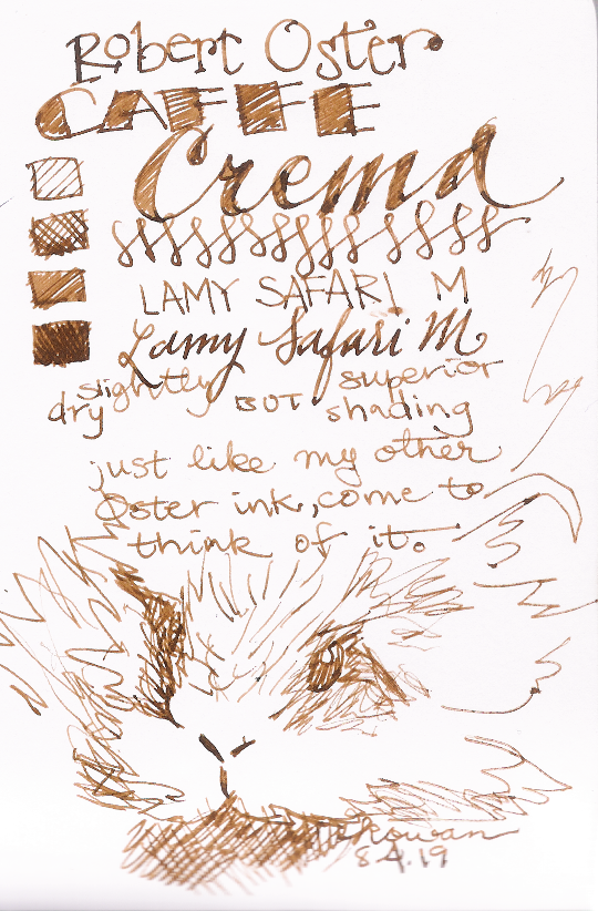
This ink is also notably lighter from a fountain pen. In the dip pen sample above it looks almost halfway between Herbin's 'coffee' and 'tea' browns - which is to say, medium, rich, fairly saturated, and balanced pretty equally between red and green undertones, while Café de Îles is reddish-leaning and Lie de Thé has a marked greenish undertone. (Diamine Sepia, in the lower right corner, is kind of an outlier with its decidedly orangey amber hue. It's almost more noticeable in dip pen, where the color is deeper, than in a fountain pen, where Sepia, like Smoky Quartz and Tierre de Feu, lays down a more lightly pigmented line.) The shading is lovely but, as noted above, the feel is a bit dry.
Pilot Iroshizuku yama-guri:

I was never actually considering buying this ink because, while Pilot's Iroshizuku inks are beautiful, they're not beautiful enough to justify their price point, IMO. 50 ml of Iroshizuku ink costs £29, so nearly 35 euros, while fellow Japanese brand Sailor's equally beautiful (IMO) seasonal inks cost <£17 for the same volume. (Robert Oster and Pelikan Edelstein inks cost just a hair less, while J Herbin's are quite inexpensive and Diamine's incredibly cheap.) But the samples are really small and give me the chance to reassure myself that I really don't want them that much more (because looking at samples online it's easy to become convinced that it just looks prettier, dammit).
So, anyway, I wouldn't say this is my ideal brown ink (too dark) and I didn't fall in love with it so much that I want to buy it, buuuuuuut... it's probably the coolest ink of the bunch nonetheless. If you look at the dip pen page you can see where the water droplets fall that it's unique among the samples because its undertone is definitely purple, with the lightest tones at the edges of the water droplet being lilac. Actually I like the darker dip pen line better; you could probably get that color with a very juicy nib, but I prefer not to write with fountain pens that wet anyway. But as you can see above, from my fountain pen it looks pretty similar to Herbin's coffee color in both value and saturation.
I will definitely be buying a bottle of J Herbin Lie de Thé, which I have enjoyed writing with quite a bit over the last nearly-a-year. I've filled multiple pens with it in that time and it continues to satisfy, but it isn't my ideal brown ink.
I would buy a bottle of Tierre de Feu as well, but I have concerns about the consistency still. There is still enough in my sample bottle to try it out in a few more fountain pens, but it felt dry, almost scratchy in the extra-fine pen I first filled with it, and that's not fun for me no matter how much I like the color.
The other two Herbin colors didn't grab me, although they're both quite pleasant and both formulas also flow fine.
Robert Oster's Caffe Crema was a more exciting color to work with, and it's closer to my ideal brown, but it's a bit too dry and a bit too light in color.
Iroshizuku yama-guri is fairly badass, but it's not for me because I prefer brighter colors. If I were a goth and wanted a bunch of dark off-blacks with different undertones and moods, I'd probably shell out for it though.
Pelikan Edelstein Smoky Quartz is a really fascinating color. I love the gentle taupe undertones and I love how beautifully it layers up; it looks great with the dip pen but it can make a soft moleskin color with a fountain pen that's not too wet. I'll probably order a bottle of it even though it isn't my ideal brown.
As for my ideal brown... idk. I guess I'll keep waiting for Pure Pens to restock Noodler's Walnut and hope that's it. In the meantime I have plenty of non-browns to write with.
eta: Upon investigation, it wasn't Noodler's Walnut (which is in stock as both bulletproof bottle and sample), but Noodler's Kiowa Pecan (which is out of stock) that I really really really wanted. And continue to want.
Anyway, that's why it took me that long. That, and I couldn't make up my mind whether to order a new pad of Tomoe River paper or not (I didn't). I loaded a bunch of pens with the first half of the brown ink samples all at once, and then I failed to use all of them up in a timely fashion and didn't have any pens to fill with the second half. Finally this week and last week I've flushed and soaked clean a bunch of pen nibs and filled three pens with the last colors of ink, and made the side-by-side comparison sheet
eight shades of brown ink (7 samples and the Sepia, which I already reviewed here) on Rhodia paper
J Herbin Café de Îles, Lie de Thé, & Tierre de Feu & Pelikan Edelstein Smoky Quartz are reviewed in the above-linked post, along with some doodles and further writing samples from fountain pens.
As you can see, the effect from a fountain pen can be quite different from that of a dip pen. All the inks look darker with a dip pen due to faster ink flow, but I particularly want to point out how much darker Tierre de Feu and Smoky Quartz look in the broader-tipped dip pen samples above. They both have an almost translucent quality and come out of a fountain pen much lighter. I would buy Tierre de Feu without hesitation, in fact, if not for the odd dry feeling.
The fourth J Herbin brown, Cacao du Brésil - I didn't put it in the first batch because it looked so much darker in the vial:
Weird, right? It's not brown at all! It's a rather pleasant medium blue-gray slate color that layers easily to black, but it's not very chocolatey at all. I can't help wondering if the ink sample somehow aged out of it or something, because my ink definitely doesn't look like the swatches and samples I've seen elsewhere such as here. Or if you look at the bleed sample in this review, perhaps it wasn't sufficiently shaken and I got a sample without the golden/sepia particles in it, or I drew them out earlier when filling a calligraphy pen, leaving none in the bottle when I went to fill the Preppy with it yesterday and make this sample? It's still a pleasant enough color, actually.
Robert Oster Caffe Crema:
This ink is also notably lighter from a fountain pen. In the dip pen sample above it looks almost halfway between Herbin's 'coffee' and 'tea' browns - which is to say, medium, rich, fairly saturated, and balanced pretty equally between red and green undertones, while Café de Îles is reddish-leaning and Lie de Thé has a marked greenish undertone. (Diamine Sepia, in the lower right corner, is kind of an outlier with its decidedly orangey amber hue. It's almost more noticeable in dip pen, where the color is deeper, than in a fountain pen, where Sepia, like Smoky Quartz and Tierre de Feu, lays down a more lightly pigmented line.) The shading is lovely but, as noted above, the feel is a bit dry.
Pilot Iroshizuku yama-guri:
I was never actually considering buying this ink because, while Pilot's Iroshizuku inks are beautiful, they're not beautiful enough to justify their price point, IMO. 50 ml of Iroshizuku ink costs £29, so nearly 35 euros, while fellow Japanese brand Sailor's equally beautiful (IMO) seasonal inks cost <£17 for the same volume. (Robert Oster and Pelikan Edelstein inks cost just a hair less, while J Herbin's are quite inexpensive and Diamine's incredibly cheap.) But the samples are really small and give me the chance to reassure myself that I really don't want them that much more (because looking at samples online it's easy to become convinced that it just looks prettier, dammit).
So, anyway, I wouldn't say this is my ideal brown ink (too dark) and I didn't fall in love with it so much that I want to buy it, buuuuuuut... it's probably the coolest ink of the bunch nonetheless. If you look at the dip pen page you can see where the water droplets fall that it's unique among the samples because its undertone is definitely purple, with the lightest tones at the edges of the water droplet being lilac. Actually I like the darker dip pen line better; you could probably get that color with a very juicy nib, but I prefer not to write with fountain pens that wet anyway. But as you can see above, from my fountain pen it looks pretty similar to Herbin's coffee color in both value and saturation.
The Verdict:
I will definitely be buying a bottle of J Herbin Lie de Thé, which I have enjoyed writing with quite a bit over the last nearly-a-year. I've filled multiple pens with it in that time and it continues to satisfy, but it isn't my ideal brown ink.
I would buy a bottle of Tierre de Feu as well, but I have concerns about the consistency still. There is still enough in my sample bottle to try it out in a few more fountain pens, but it felt dry, almost scratchy in the extra-fine pen I first filled with it, and that's not fun for me no matter how much I like the color.
The other two Herbin colors didn't grab me, although they're both quite pleasant and both formulas also flow fine.
Robert Oster's Caffe Crema was a more exciting color to work with, and it's closer to my ideal brown, but it's a bit too dry and a bit too light in color.
Iroshizuku yama-guri is fairly badass, but it's not for me because I prefer brighter colors. If I were a goth and wanted a bunch of dark off-blacks with different undertones and moods, I'd probably shell out for it though.
Pelikan Edelstein Smoky Quartz is a really fascinating color. I love the gentle taupe undertones and I love how beautifully it layers up; it looks great with the dip pen but it can make a soft moleskin color with a fountain pen that's not too wet. I'll probably order a bottle of it even though it isn't my ideal brown.
As for my ideal brown... idk. I guess I'll keep waiting for Pure Pens to restock Noodler's Walnut and hope that's it. In the meantime I have plenty of non-browns to write with.
eta: Upon investigation, it wasn't Noodler's Walnut (which is in stock as both bulletproof bottle and sample), but Noodler's Kiowa Pecan (which is out of stock) that I really really really wanted. And continue to want.