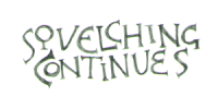
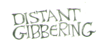
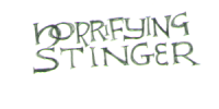
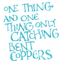
cimorene: The words "You're doing amazing sweetie" hand lettered in medieval-reminiscent style (you're doing amazing sweetie)

Read more... )

Most of these were lettered in Lamy Vibrant Pink ink (the exceptions are obvious). They got a little yellower in color correction than they look IRL.
cimorene: closeup of four silver fountain pen nibs on white with "cimorene" written above in black cancellaresca corsiva script (pen)
I have a lot of fountain pen ink. It's not that I don't want it - I feel a compulsion to have all the colors - it's just that I can't use it up very fast.

I also have some empty sample vials because I love to order fountain pen ink samples.

So - can I send some samples to anyone? I realize that the amount of people who use bottled ink is even smaller than the amount who use fountain pens, but it's not impossible...
cimorene: closeup of four silver fountain pen nibs on white with "cimorene" written above in black cancellaresca corsiva script (pen)
This is what I did while we were rewatching, by the way. I should probably have been knitting instead, but I'm in love with the limited edition olive Sport and matching Herbin Empire Green [a review because product listings never have adequate photos] ink cartridges I got myself last holiday season. Anyway, here they all are!


cimorene: closeup of four silver fountain pen nibs on white with "cimorene" written above in black cancellaresca corsiva script (pen)
I just noticed that the fountain pen ink blog Mountain of Ink (I think run by a blogger named Kelli, but I prefer to use the blog name as it's a unique identifier) made a post to celebrate her 1700th ink review in which she recommends her "favorites" in every color category. Mountain of Ink - 1700 Inks! (She uses the color categories typically used in fountain pen fandom: black, blue black, gray, brown, red, orange, yellow, green, blue, teal, and purple. Some also add "turquoise", which refers specifically to my all-time favorite family of shades - in the realm of colors that people think of when discussing the stone turquoise, but towards the bluer end of them. Turquoise, the stone, also comes in colors that the fountain pen world would class as "teal".) I say "favorites" with quotation marks because she picks up to eighteen shades of each of these groups, which... I mean... I don't disbelieve that she uses them all frequently if she says she does, although I do know I never used ink fast enough to have done that even when I was drawing like 8 hours a day for several months. I just personally find the use of "favorite" a little bemusing for a group that size, which is surely more than the total number of inks of a single color family that many people even own or want to own. She also has quite a few color samples in her favorites that are near enough to identical that, okay, fair enough, you're bound to like both colors since they're THE SAME, but surely nobody needs to own both of them.

ANYWAY, as I was saying, I was really excited to see this post because I like Mountain of Ink's ink reviews. She has a broad enough range of samples that they tend to cover any ink I might be curious about. And if I am curious about it, her reviews are typically the best review of that ink out there because she takes good photos of the ink in washes, drops, and writing in all the main sizes on all the popular fountain pen papers, and then compares them side by side to the most similar other inks she has. The side by side comparisons are the most useful way to (a) avoid accidentally getting identical inks when you don't want to and (b) determine exactly which shades you like the best.

But this reminds me of nail polish fandom. I had an interest in nail polish colors and have had a shoeboxfull or more of them for ten years or so, and as a result I read a lot of nail polish reviews because that's the best way to find good pictures of the color so you can tell what it actually looks like... that and the side by side comparisons testing for duplicates ("dupes" as the nail polish fandom call them), because in many people's opinion, you don't need two of the identical color. But many nail polish reviewers had a hilariously different definition of "dupes" to mine. Nail polish bloggers will often say that colors aren't "dupes" if you can distinguish them with the naked eye, but in a practical sense, my standard for individuality in nail polish is a lot higher than that. My need for color specificity on my nails is not at the level it would be for a professional graphic artist specifying shades for a website or a logo. If I look down at my hand and it looks like it did last week, I'm gonna get bored, even if I know that I could distinguish the shades with the naked eye if I happened to have them side by side to inspect.

And I do feel a certain acquisitiveness, in ink as well as in nail polish, towards the colors themselves, simply because they're pretty, and an urge as a result to just like... obtain and collect them... in a way that isn't, erm, necessarily that connected to the practical use that I have for the substances in question. (I've only ever used like AT MOST two nail polishes in a week, but usually I can't be bothered to even use one every three weeks, so most of the polishes in the box are pretty much just sitting there emitting somewhat worryingly toxic fumes all the time.) I had a similar issue with a need to acquire All the Best Colors of eyeshadow a few years ago, when even at peak eyeshadow use, I mostly only really wanted to use like... maybe five or six shades?

You really can waste a LOT of money if you feel the need to acquire a full range of all the best shades in every single product you come in contact with that colors things regardless of if you're going to use those colors or not.

The eyeshadow isn't hurting anybody being there unused since I mostly can't be bothered to use it... but I still might at least use SOME of it in the future, although it's all passed its use-by date and technically should be thrown away I think. But since nail polish both takes up storage space I don't have and emits smells that are not pleasant and technically a bit toxic, I did decide to sort of... downsize it. I found, though, that even though I am fine intellectually with the idea of only ever using one or two shades of it again, it was really hard to pick out ones to throw away. When you look at a little bottle of lacquer in isolation, it always looks so pretty! So the shoebox is still mostly full. (And a hazard to foot traffic, because it's temporarily without a shelf spot.)
cimorene: Grayscale image of Jean Hagen as Lina Lamont in Rococo dress and powdered wig pushing away a would-be kidnapper with a horrified expression (do not want)
I think the number of planned knitting projects I have, not to mention in-progress projects where I don't remember my place, is making me reluctant to start knitting again, but I really ought to get some stuff knitted! (Also the fact that I feel reluctant to watch new tv. Somehow my attention span for fiction doesn't seem up to it.)
I completely finished a knitted worsted-weight hoodie with pockets over a year ago and ordered a zipper to sew in, and then we ended up moving from the other side of the house to this side before I sewed it in and it got lost and hasn't turned up since. I think I'm gonna have to order a second zipper if I want to wear it this fall (one year behind schedule).

Also we still don't have half our radiators working. I'm afraid I might have to be the one to call down the list in the phonebook... maybe I could do that if I took a tranquilizer first. Or a couple glasses of wine.

These reflections on seasonal wardrobe brought to you by discovering to my dismay that my dressy pair of shorts (that is, the ones that weren't cutoffs) didn't fit anymore, after not trying them on for probably six years or something, but needing some for work. In last week's heat wave, I needed some to work outside in the sun, but they have to be long enough to have adequate pockets and prevent my thighs from sticking to plastic chairs etc. It took me eight hours of online shopping to successfully order some and my mood was so black afterwards that it took like five hours shopping for fountain pen ink to recover. (Apparently it's more the shopping than the purchasing in the case of fountain pen ink, which is kind of funny! I only ordered one bottle of ink in the end, but I debated the merits of like twelve different colors.)
cimorene: The words "You're doing amazing sweetie" hand lettered in medieval-reminiscent style (you're doing amazing sweetie)



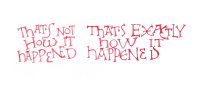
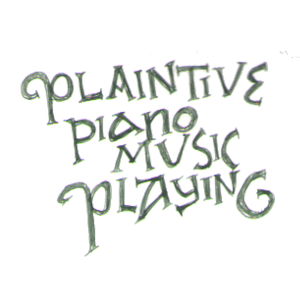
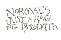
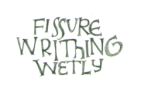
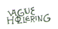
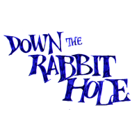
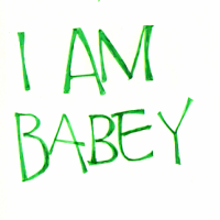
We've got a catchphrase from the iconic little dude from Line of Duty, two reaction images, and a random quote from Rhod Gilbert on Would I Lie to You. The ink is Diamine Marine, KWZ Green Gold, Herbin Vert Réséda, and Diamine Claret.
cimorene: closeup of four silver fountain pen nibs on white with "cimorene" written above in black cancellaresca corsiva script (pen)


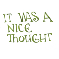
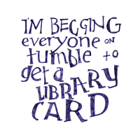
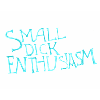
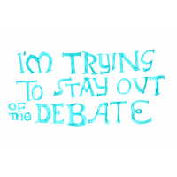
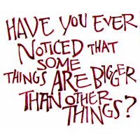
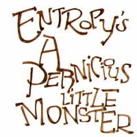
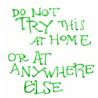
The 1st one was probably my grandfather's favorite catchphrase. That's in Diamine Claret; the 2nd (from Tumblr) is in J Herbin Diabolo Menthe; the 3rd (describing Richard Ayoade and Noel Fielding) is in KWZ Honey; and the 4th (it was Alan Davies on QI but I can't remember what it's about) is in Sailor Souten.
cimorene: closeup of four silver fountain pen nibs on white with "cimorene" written above in black cancellaresca corsiva script (pen)


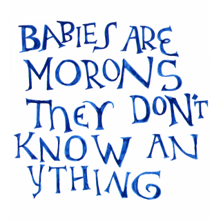
Tristana knows nothing and is frequently surprised or unwise, so this is what we've started saying like, all the time. (I KNOW it's a quote from somewhere but I don't know where and I can't find it with google now so like... it's either a comedy film or a sitcom or any one of like twenty some youtube channels. BONUS: Have I got it slightly wrong? Is it actually 'idiots'?)

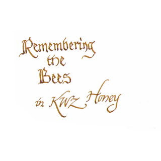
For example, every now and then a bee gets in - there are lots of them in the backyard - and while the other cats have shown themselves a little too eager to chase, she goes right for them. I've seen her gently pat a bee against the window under the pad of her paw. She's just lucky that it wasn't hard enough to hurt the bee but too close for it to move around and sting her. When we briefly let her into the unconditioned porch space after emptying it, she found two dead bees so far in the corner that the broom apparently couldn't reach them when we swept it out and promptly started playing with them. She was about to eat one within five seconds and had to be arrested, and then later the SAME DAY had to be arrested trying to eat a live (but sick) bee that had landed on the floor. So while the original context of the meme "Remembering the bees" is remembering the international plight of the bees, we have taken to suggesting that she is remembering the bees and wondering why she isn't allowed to eat them.


(The above is appropriately in KWZ Honey, an ink I love to bits. The top one is in Sailor Souten, but it isn't showing to best advantage there: it's not just a beautiful azure, it has dramatic shading effects and a pretty red sheen in the proper light - I haven't photographed it properly myself, but you can see it in ink reviews like this one.)
cimorene: The words "You're doing amazing sweetie" hand lettered in medieval-reminiscent style (you're doing amazing sweetie)
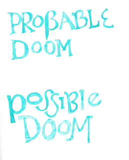
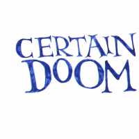
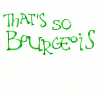
I was fond of "certain doom", which I thought really captured a frequent theme of the last few years, but it occurred to me that it might be too pessimistic (at times), so I made this:


My sister says it should be a wall sign with one of those spinning arrows in between.


The second one above was [tumblr.com profile] septembriseur and the third was David Mitchell.
cimorene: closeup of four silver fountain pen nibs on white with "cimorene" written above in black cancellaresca corsiva script (pen)
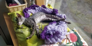
Most of my time lately has been drawing letters, reading and kittensitting. (ETA: these pictures look so tranquil but she spends like eight hours a day running around, sometimes literally, chasing everything in sight, trying to eat dustbunnies and bits of plastic and climb into houseplants and pull stuff out of the trash, and pounce-attacking us and Snookums. It's just hard to get pictures of her when she hasn't run out of batteries temporarily.)


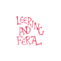
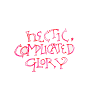
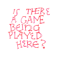
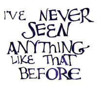
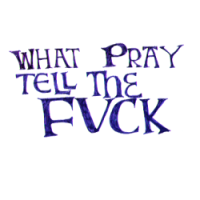
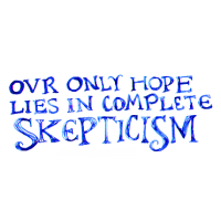
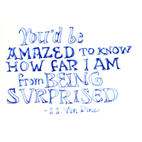
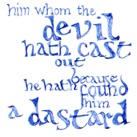
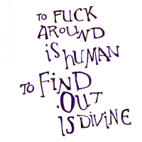
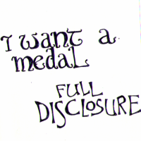
3 and 4 are quotes from SS Van Dine, 8 from William Morris, 11 and 12 from Technology Connections on Youtube, 13 from Hydraulic Press Channel on Youtube. 10 is the meme we use to describe Tristana, but I looked it up on whatsyourmeme and apparently it's not originally spelled like that so I'm not sure if it actually is a meme.


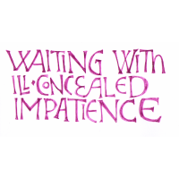
1-4 are more or less David Jones-influenced. 1 & 14 - 16 are in Sailor Shigure, 12 is in J Herbin Lie de Thè, 11 is in Diamine x Cult Pens Robert sheen ink (but you can't see the sheen at all because I didn't shake it properly), 6 is in Herbin Diabolo Menthe, 7 is in Diamine Eau de Nil, and the rest are in Diamine China Blue and Diamine Apple Glory.
cimorene: closeup of four silver fountain pen nibs on white with "cimorene" written above in black cancellaresca corsiva script (pen)
When I last wrote about brown fountain pen ink samples, last June, I really had too many of them... or not enough spare easy-to-fill pens lying around... or not enough willingness to dump unused ink out (and do them consecutively, washing the pen in between, I mean), arguably. Ink isn't a precious commodity or anything, so it's just the pure principle of wastefulness that upsets me if I spill it or have to empty it prematurely.

Anyway, that's why it took me that long. That, and I couldn't make up my mind whether to order a new pad of Tomoe River paper or not (I didn't). I loaded a bunch of pens with the first half of the brown ink samples all at once, and then I failed to use all of them up in a timely fashion and didn't have any pens to fill with the second half. Finally this week and last week I've flushed and soaked clean a bunch of pen nibs and filled three pens with the last colors of ink, and made the side-by-side comparison sheet here. )
cimorene: cartoony drawing of a woman's head in profile giving dubious side-eye (Default)
Hello, new people and fellow rediscoverers of DW!

In light of Tumblr Exodus I thought I would point to the bio in my profile and the blanket permission statement there (though in short: comments from new people are welcome; feel free to follow me; feel free to introduce yourself if we don't know one another; almost nothing is access-locked). For anyone newly subscribing to this blog, you may be interested in the introduction post 10 Things I Assume You Know About Me If You Read My Journal (this was a meme that went around LJ in 2006. I've just had it pinned to my profile & periodically updated)(though in short: I'm 36 and have been in fandom since 2001; [personal profile] waxjism is my wife).

I have been using Tumblr more than DW over the past few years, and am now making an active effort to increase my engagement here. (I need to look for more communities, I suppose.) I used to do 'what am I reading and what am I watching' sort of roundups here, and I haven't done one in ages; therefore, here's a hopefully comprehensive Survey of My Fannish and Non-Fandom Interests and Hobbies )
cimorene: minimal cartoon stick figure on the phone to the Ikea store, smiling in relief (call ikea)
💧 I'm still using up the brown ink in the pens I put it in a couple of weeks ago so I still haven't been able to test out the last few shades of brown ink. Clearly I need more cheap disposable pens. And on the plus side, the cheapest fountain pen, the Platinum Preppy, is the one that's the least prone to drying out. ... On the minus side, my pen cup is close to being full of fountain pens now. I've already moved everything that wasn't a fountain pen into a lesser pen cup of shame behind the main one.

🔍 Nib tuning IS going to happen! We walked to Motonet last week when it was cold and windy - haha jk it's STILL cold and windy - to grab the set of three magnifying loupes (aka hand lenses) that I will need to check nib alignment before attempting to grind or smooth away any trouble spots. I've got my info posts and tutorials all queued up and the sheets of smoothing mylar I ordered from my favorite small British fountain pen specialty shop, The Writing Desk, arrived weeks ago. I simply hadn't bought the lenses because it was an errand that had to be done on foot.

📐 Motonet is a huge tool & hardware store that sells car stuff & tool stuff & garden stuff but not, like, lumber. They have about four times the power tools of Clas Ohlson, though, and I like to go and ogle them. (I keep MEANING to buy a corded power drill... .) We stumbled and hit ourselves on the Ryobi display. Ryobi's branding is stellar. Everything is so modern, yet rugged looking, in that beautiful happy neon spring birch bud green. While I was talking about power drills, [personal profile] waxjism found this cordless hand vac and determined that since we have so much dust, actually it would be a savings rather than a waste of money to get a cute-yet-rugged tactical hand vac, so we did. The packaging and the instructions are so serious, I feel like I've bought a very cheap and small 40€ car. Except we were so distracted and enthusiastic - due to being there together, and talking about it - that we forgot to really read the package. So we didn't notice that Ryobi's 18V cordless lithium battery tools come without the battery because the battery is interchangeable, rechargeable and practically everlasting, its design dating to the 90s; and that the cheapest of these batteries is about twice the cost of the vac, and the cheapest of the chargers is about 50€, with the cheapest battery+charger pack being around 100€. So we definitely still have to do some more reading before we can purchase that and actually use it to vacuum anything. I'm not sure what Ah is yet.

🔨 Mece was here months ago and told us the reason our wall-mounted entryway coatrack shelf keeps falling down is that it was not anchored with the right anchors for its weight and the wall material, twice in a row. Like, why did we even call maintenance to do it at all if they were just going to do it wrong?! They're the pros! We could just do it wrong ourselves!! So we went to Clas Ohlson and read all the stuff and bought what seem to be the right sort of wall anchors, only I'm not really sure if we can get them in without a strong power drill anyway. So we might have to either borrow MIL's or call maintenance again. The latter is much easier, but can we trust them? We've just been using this shelf for a year tilted halfway out of the wall with fewer coats hung on the hooks. Probably should not do that. I've been putting off seeking out the proper tutorials for a month now for fear that they'll make it clear that we can't do it ourselves and we have to call someone. We hate calling someone.
cimorene: cartoony drawing of a woman's head in profile giving dubious side-eye (Default)
The quest for the perfect brown ink commences.


Herbin Café de Îles (in a Lamy Safari M), Herbin Tierre de Feu (in a Hero 616 petite with extra-fine nib), Herbin Lie de Thé (in a Lamy Safari with 1.1 mm stub nib), and Pelikan Edelstein Smoky Quartz (in a Platinum Preppy 05/M). Clairefontaine white paper.

More doodles and my verdicts:Read more... )
cimorene: cartoony drawing of a woman's head in profile giving dubious side-eye (Default)

Private Reserve Avocado fountain pen ink with Lamy Safari B and Speedball C-2 italic and Hunt school nib, plus water and paintbrush.
Read more... )
cimorene: cartoony drawing of a woman's head in profile giving dubious side-eye (helen kane)

Diamine China Blue fountain pen ink in a Platinum Preppy 05 M and Speedball B-3 dip pen nib, plus brush and water.
Read more... )
cimorene: cartoony drawing of a woman's head in profile giving dubious side-eye (Default)


Diamine Red Dragon fountain pen ink on Clairefontaine white paper with Speedball C-4 italic and B-5 dip pen nibs, Hero 616 Doctor fountain pen in extra fine, plus brush and water.
Read more... )
cimorene: cartoony drawing of a woman's head in profile giving dubious side-eye (Default)

L’Artisan Pastellier’s “Encre Classique” fountain pen ink in the color “Olive”. On Clairefontaine paper, applied with Speedball C-0 and C-4 italic and B-3 dip pen nibs, a Kaweco Brass Sport fountain pen with EF nib, and a paintbrush (and water).
Read more... )
cimorene: cartoony drawing of a woman's head in profile giving dubious side-eye (Default)

Private Reserve’s “Orange Crush” fountain pen ink on Clairefontaine white paper applied with Speedball C-0 italic, C-4 italic, and B-3 dip pen nibs, a Hero 616 petite fountain pen with an extra fine nib, and a paintbrush (and water).
Read more... )
cimorene: cartoony drawing of a woman's head in profile giving dubious side-eye (love)

Diamine Jade Green fountain pen ink on Clairefontaine paper using Pilot Parallel Pen 6mm and Lamy Safari B (plus a brush and water).

Read more... )

Profile

cimorene: cartoony drawing of a woman's head in profile giving dubious side-eye (Default)
Cimorene

May 2025

S M T W T F S
    12 3
4 5 6 7 8 9 10
11 1213 1415 1617
18 192021222324
25262728293031

Syndicate

RSS Atom

Most Popular Tags

Style Credit

  • Style: Practically Dracula for Practicalitesque - Practicality (with tweaks) by [personal profile] cimorene
  • Resources: Dracula Theme

Expand Cut Tags

No cut tags
Page generated 22 May 2025 04:44 pm
Powered by Dreamwidth Studios