I got a great idea that I was going to make image posts on Tumblr for my top lists of fountain pen ink (favorite inks and inks at the top of my to-buy list), but you need good swatches for that. Or I mean, that was my vision: the whole point is they're pretty.
And so I went to my favorite ink review blog, Mountain of Ink, and discovered that she's got a no-rightclick javascript over all her individual ink swatch images. Obviously, since I'm a 42-year-old millenial who has been using computers since I was a toddler, I could get around this, but I don't want to use her images if she doesn't want people to use them. (I would only have done so in the good-faith belief that normal credit and linkback was all that courtesy required. And I would have earnestly recommended her blog too, because that's what I always do!)
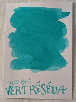
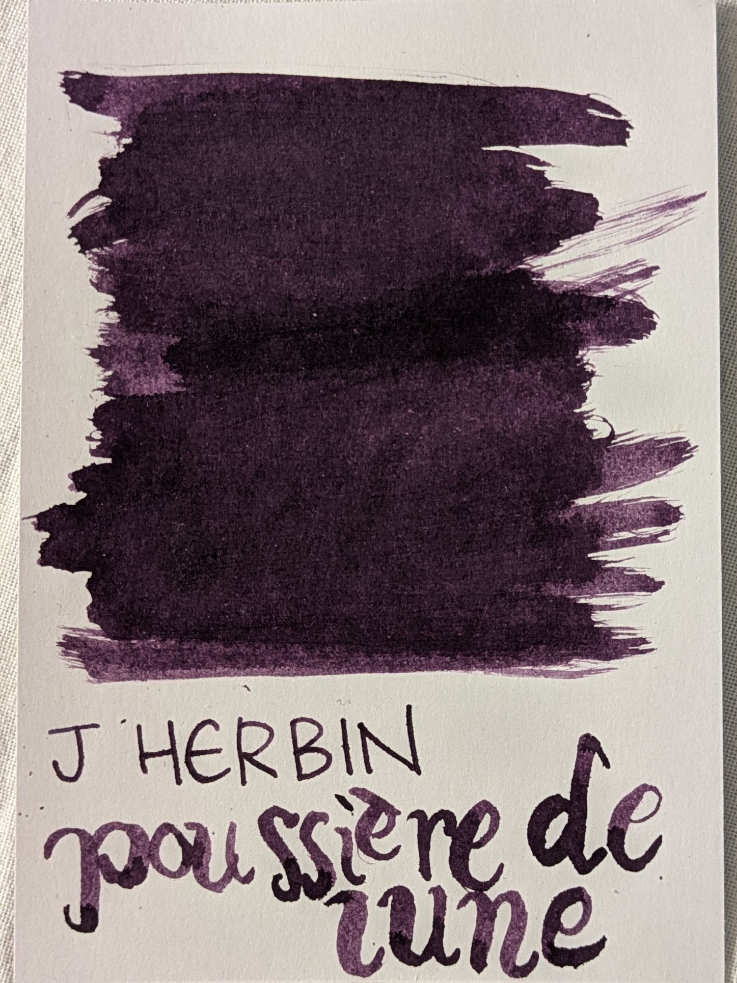
So that means I'd have to make and photograph my own ink swatches. Making's easy (if slightly time-consuming), but taking good photos of them is hard! Like here's some swatches I had knocking around in my folder: my favorite CRAZY expensive ink, Sailor Ink Studio 160 (a light minty green); my favorite all-purpose ink, J Herbin Vert Réséda (a bright teal with a very slight leaning towards green); a lovely dark moody ink, J Herbin Poussière de Lune (a saturated reddish plum purple).


click for bigger
See, it's overcast but bright today - the sky is a solid opaque cool milky white. I took these photos two feet from an open window, with my bright light therapy sunlamp shining from the other side at the same distance. And the color reproduction is still not good! You can see it in the whites - everything looks cooler and dimmer than reality.
Sure, I could color correct them with an image manipulation program, but I think that defeats the point of swatches. And I'm not into it enough to, like, sign up for a Skillshare course in photographing art. So IDK. Maybe I will get more into making swatches. I actually bought a glass dip pen for this exact purpose a couple of years ago, only I broke the tip of the pen the first time I used it and then I didn't buy another (I have regular dip pens though so it's not really necessary).
And so I went to my favorite ink review blog, Mountain of Ink, and discovered that she's got a no-rightclick javascript over all her individual ink swatch images. Obviously, since I'm a 42-year-old millenial who has been using computers since I was a toddler, I could get around this, but I don't want to use her images if she doesn't want people to use them. (I would only have done so in the good-faith belief that normal credit and linkback was all that courtesy required. And I would have earnestly recommended her blog too, because that's what I always do!)
So that means I'd have to make and photograph my own ink swatches. Making's easy (if slightly time-consuming), but taking good photos of them is hard! Like here's some swatches I had knocking around in my folder: my favorite CRAZY expensive ink, Sailor Ink Studio 160 (a light minty green); my favorite all-purpose ink, J Herbin Vert Réséda (a bright teal with a very slight leaning towards green); a lovely dark moody ink, J Herbin Poussière de Lune (a saturated reddish plum purple).


click for bigger
See, it's overcast but bright today - the sky is a solid opaque cool milky white. I took these photos two feet from an open window, with my bright light therapy sunlamp shining from the other side at the same distance. And the color reproduction is still not good! You can see it in the whites - everything looks cooler and dimmer than reality.
Sure, I could color correct them with an image manipulation program, but I think that defeats the point of swatches. And I'm not into it enough to, like, sign up for a Skillshare course in photographing art. So IDK. Maybe I will get more into making swatches. I actually bought a glass dip pen for this exact purpose a couple of years ago, only I broke the tip of the pen the first time I used it and then I didn't buy another (I have regular dip pens though so it's not really necessary).
(no subject)
Date: 25 Jun 2025 03:33 pm (UTC)I have officially used up one cartridge for my fountain pen. It feels sort of thrilling to have to replace it and a justification to buy another pen so I can have more colours.....
you shall not tempt me into dip pens and bottled ink, you siren of the pen!!!
(no subject)
Date: 25 Jun 2025 04:02 pm (UTC)You can also use multiple colors with one pen consecutively, if you rinse it thoroughly! But you do need some more pens if you're gonna have multiple colors at once of course.
But you don't need dip pens - that's completely different; they're an art and calligraphy thing, not really for just writing. They're the precursor to the invention of the fountain pen. They are pretty cheap, so a lot of ink reviewers use them for part of their routines, but there's no reason you need them if you're not going into the art.
(no subject)
Date: 25 Jun 2025 09:46 pm (UTC)The best Vert Réséda cartridge dupe is Kaweco Paradise Blue cartridges -they're almost exactly the same. Caran d'Ache Hypnotic Turquoise cartridges are also close.
There's nothing similar to Ink Studio 160, though, I'm pretty sure. In bottles, even, there's nothing all that close. Lighter, more pastel shades are not usually available in cartridges - presumably they're less popular, which would make sense.
(no subject)
Date: 26 Jun 2025 12:13 pm (UTC)(no subject)
Date: 26 Jun 2025 06:08 pm (UTC)